Explore the Toolkit
Made with Numerro
Pricing & Sign Up
Learn
Go To Member's Hub
Login
Try it Free
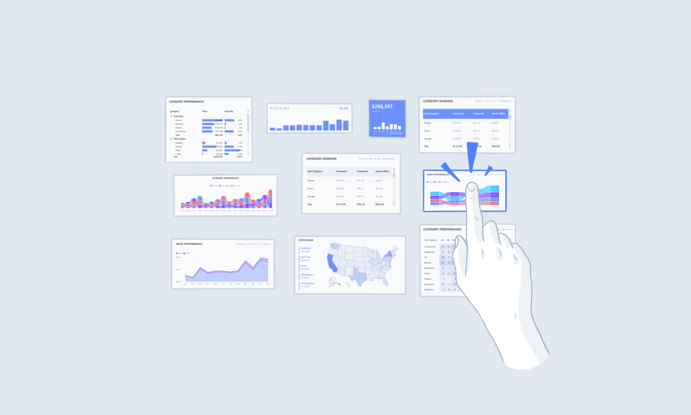
Using Comparison Visuals
Using Grouped Bar Charts
Utilize the correct Power BI visuals for comparing data. Grouped bar charts are great for comparison.
Summary
Consider using a
grouped bar chart in Power BI
when:
Comparing multiple sets of data in a single view
Analyzing relationships across two or more categories
Additional Tips
Process Guide
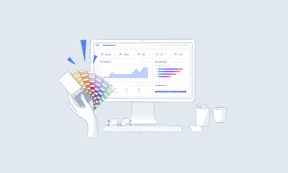
Choose Your Layout
Using An Overlay Menu
Menu Component Breakdown
Enhancing Report Performance
Reduce Visual Interactions
Suggested Guides
Handbook
The Complete Guide to Designing a BI Dashboard Mockup
Handbook
The Complete Guide to Power BI Visuals + Custom Visuals
Handbook
The Complete Guide to Power BI Themes + 12 Examples
Suggested Blog Posts
Power BI
Tracking your Goals with KPIs in Power BI
Embedded Analytics
How to Embed Analytics With Power BI - Basic & Advanced
Data Visualisation
Top 4 Data Visualization Best Practices
Ready to improve your reports?
Get free access today.
View Pricing
Try It Free


.png)