Explore the Toolkit
Made with Numerro
Pricing & Sign Up
Learn
Go To Member's Hub
Login
Try it Free
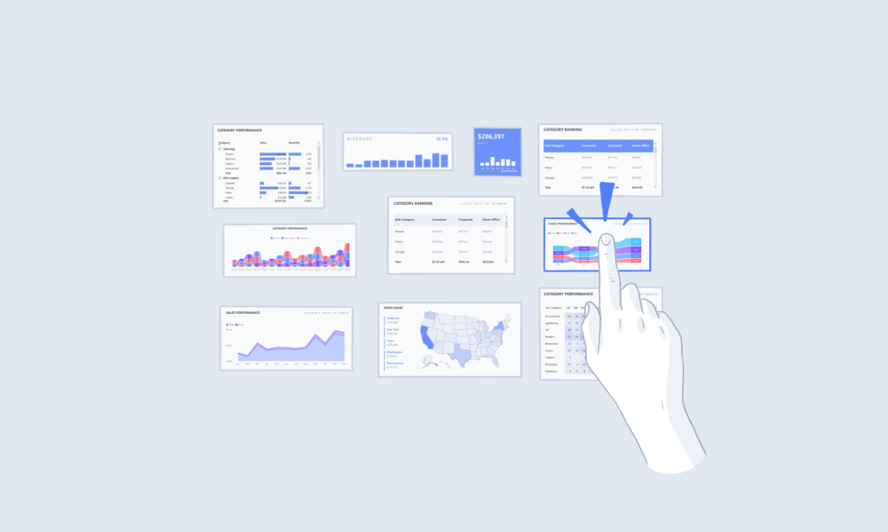
Using Comparison Visuals
Using Shape Maps
Utilize the correct Power BI visuals for comparing data. Shape maps are great for comparison data.
Summary
Consider using shape maps in Power BI when:
Data relates to broad geographical areas like states, regions, or countries
Comparing
geographical areas
to data can surface deeper trends
Additional Tips
Working with Colors
Pick Colors That Are Easily Distinguishable
Using Visuals
Avoid Slanted Labels
Using An Overlay Menu
Menu Component Breakdown
Suggested Guides
Handbook
The Complete Guide to Power BI Themes + 12 Examples
Handbook
The Complete Guide to Power BI Visuals + Custom Visuals
Handbook
The Complete Guide to Designing Power BI Reports
Suggested Blog Posts
Dashboard Design
Why You Need Well Designed Power BI Reports
Embedded Analytics
How Is Embedded Analytics Different From Traditional BI?
Data Visualisation
Using Power BI Scorecards & Metrics Visuals
Ready to improve your reports?
Get free access today.
View Pricing
Try It Free


.png)