

How you build your dashboard is critical to ensuring user engagement and information retention.
Most people go straight to thinking about dashboard design, but before that, it's super important to get the basics right. Below are the four basic steps to follow before you begin to go down the rabbit hole of designing your dashboard.
The foundation of any dashboard is the purpose. Why are you building this dashboard? What do you want the user to gain from seeing this data? Having a clear purpose not only provide guidelines but will also drive which data you choose to use, what insights you decide to be focal points, and help you solve the right problems. Identifying the purpose will ultimately determine whether your dashboard is relevant and useful to the intended audience.
After you're clear on the purpose, the next step in building your dashboard is the data. Choosing the right dataset determines which insights you can drive, and if you're unable to show useful insights then the rest of the dashboard is redundant. This is why it's essential to make sure you're using the right data before you go into building the dashboard and risk wasting time.
To evaluate whether you're using the right data in your dashboards, identify the key pieces of information you want the audience to retain and confirm your data can provide them.
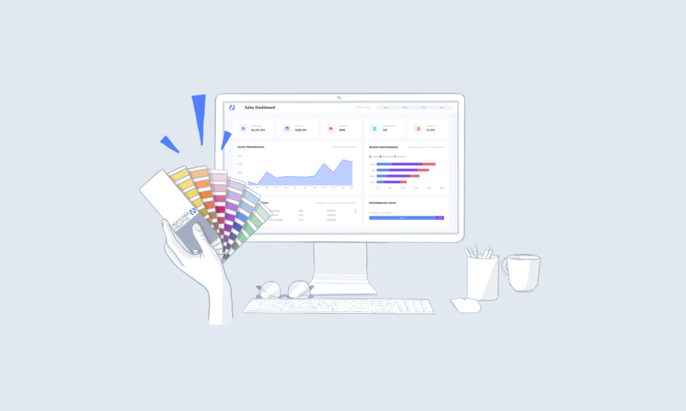
Once you've decided on the data that you're going to use as the foundation of your dashboard, you can begin to build your visuals. But before you work on the visualization of your data, you should decide on what insights you want to include. After you've identified these insights, you can work on how you want to visualize them so that you can deliver value to your audience.
It's important to match the insight with the most appropriate visual, some examples of how you can use different visuals to show different information can be found here.
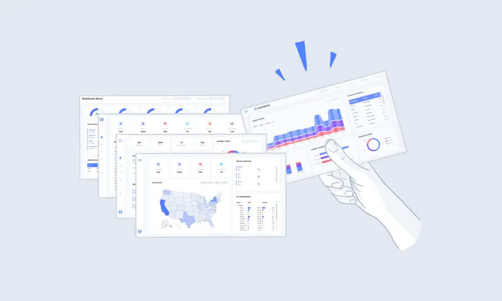
Now you've aligned your insights with the right visual you can start to build the layout of your dashboard. It's best practice to make sure the key trends you want to draw attention to are visible at a glance. Positioning these key trends at the top, such as important KPI's, will ensure the audience takes away the main points. This can then be followed by trend-based data in the middle of the dashboard and the most granular metrics at the bottom. Once you've built this layout you can simply plug the right visual into each section.
The layout is important in making sure your dashboard is easy to understand and has a logical flow between the different insights. Using a grid layout can help you to create a consistent and appealing structure with your dashboards that clearly emphasizes each visual for users.
Now you've got the basics covered, you can go onto the fun bit of designing your dashboard!
And if you're looking more advanced design considerations, check out our video on designing Power BI Dashboards for Mobile


.png)